Darllenwch y dudalen hon yn Cymraeg
A year ago, on 27 November 2019, we published the sixth edition of the Welsh Index of Multiple Deprivation (WIMD).
The index ranks small areas in Wales on several types of deprivation, like income and housing, and combines these into an overall measure of multiple deprivation.
Less than four months later, the World Health Organization had declared a pandemic and the UK was in lockdown. Although it may be a while before we understand the longer-term impact on communities in Wales, the index can help us understand which communities were most vulnerable before the pandemic and may need more support. It’s one of several data sources feeding into Public Health Wales’ Community Response mapping tool.
We can also use the index to examine the differential impacts of the virus on communities.
Deprivation and the virus
Early on, some described COVID-19 as a ‘great equaliser’ or ‘leveller’. But soon, data on the effect of the virus, as well as the impact of restrictions on jobs and lives, proved that equality of outcome is not a strong feature of this pandemic. We now know that the impact of the virus on individuals can vary due to many characteristics or circumstances, including the relative deprivation of the area you live in.
The Welsh Government’s Technical Advisory Cell (TAC) recently published a report focussing on COVID-19 and health inequalities and found that:
‘Based on data from the first few months, we can see that people in the most deprived fifth of the population in Wales are twice as likely to be admitted to hospital, to end up in ICU, and to die from COVID-19 as those from the least deprived fifth.’
TAC, October 2020.
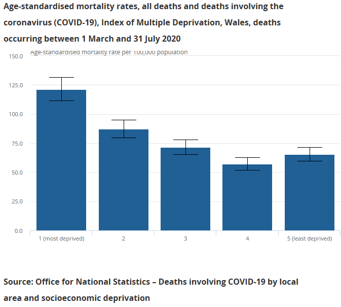
The Office for National Statistics (ONS) have shown that, although general mortality rates are normally higher in more deprived areas, so far COVID-19 appears to be taking them higher still.
Which groups are over-represented in deprived areas?
But what kind of people live in the most deprived areas? Earlier this month, for the first time we published statistics on deprivation and protected groups. These examine how groups differ in terms of deprivation levels of the areas they live in, using statistics drawn from several years’ worth of the Annual Population Survey, to allow us to include some smaller sized groups. Some of the features of people living in the 10% most deprived areas are:
- Nearly half of all people living in these areas are single, compared to around a third across Wales.
- Disabled people make up 1 in 3 people in the 10% most deprived areas, compared to fewer than 1 in 4 across Wales as a whole.
- More than 1 in 10 people in the most deprived areas are from Black, Asian, or Minority Ethnic groups, which make up 1 in 20 of all people across Wales.
- The chance of living in the 10% most deprived areas is also slightly higher for females than males, and for children and young people compared to older people.
Don’t judge a book by its Lower-layer Super Output Area
Categorising the areas people live in by overall deprivation is straightforward to do, and can be useful to draw out aggregate trends from data about different groups of people. But it is not always an accurate indication of the socio-economic circumstances of each individual. And deprivation is not always experienced in concentrations of people within the same communities: three out of five people who are income deprived live outside the most deprived fifth of areas in Wales.
Administrative Data Research (ADR) Wales has an ongoing ambition to link together datasets to better understand the circumstances of individuals, rather than the areas they are from. This would also allow us to learn more about people with many overlapping and inter-related features of deprivation, for example ill-health and poor housing, wherever they live.
It could be that, whatever your individual circumstance, living in an area with a high concentration of deprived people may exacerbate negative outcomes, and data linking work may help to quantify this in future. The most deprived areas face significant challenges, and this year for the first time we have identified areas of deep-rooted deprivation, consistently among the most deprived 50 in Wales since WIMD 2005.
Tools to help explore inequality
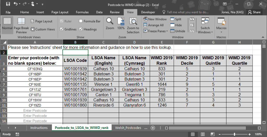
For now, exploring data by area deprivation has many plus-points. It is easy to combine WIMD information with datasets including location such as postcode or LSOA, to gain new insights on trends by deprivation. We have published WIMD ranks and indicator data with LSOA area codes, and a lookup spreadsheet where you can paste in a list of postcodes to output the area codes, WIMD ranks and deprivation groups.
There is still much to explore in the data behind WIMD 2019. We have been prioritising follow-on outputs and datasets to help users of the index to draw out key messages and bolster their own research. You can access the information on our WIMD website, or get in touch with the team to find out more.
Nia Jones
Social Justice Statistics
Email: stats.inclusion@gov.wales

Pingback: Data Science projects: Identifying and describing clusters of deprivation | Digital and Data Blog